Colors and Type
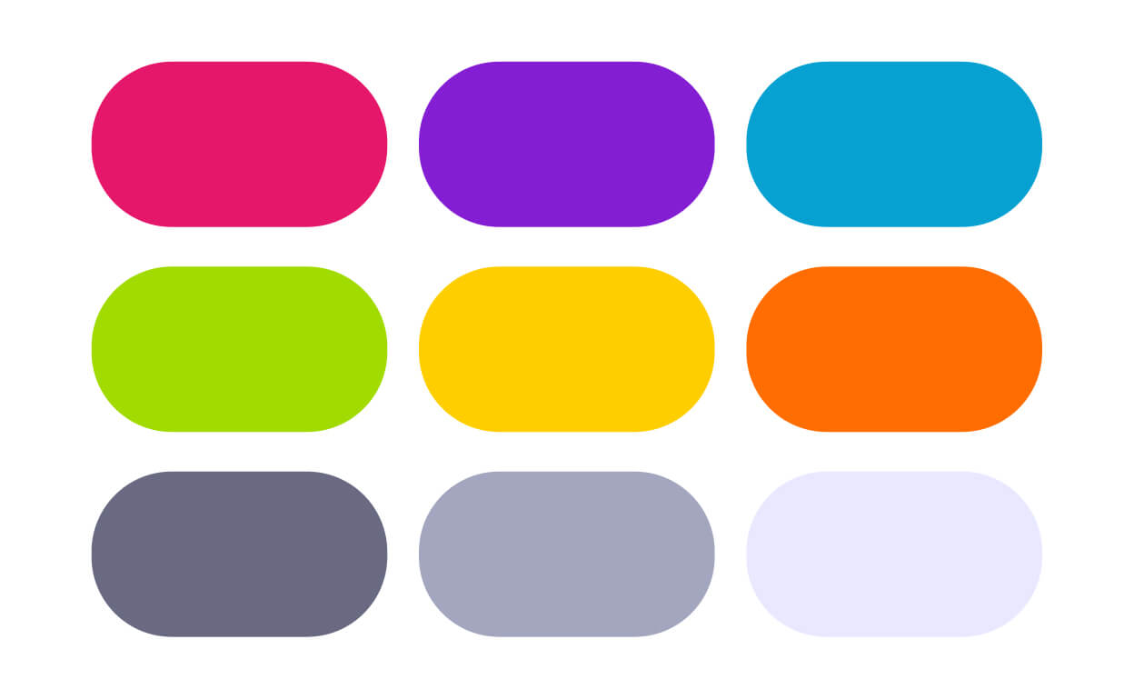
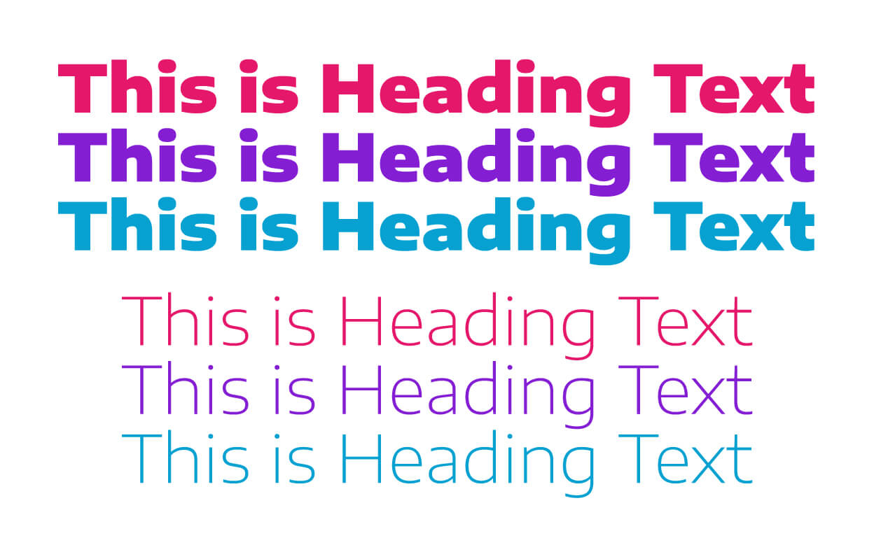
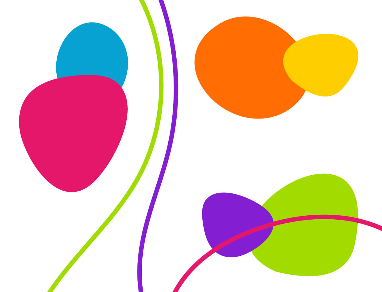
Ectovox began by brainstorming ideas for graphic elements that would create a unified visual brand. Rain Drop’s previous palette consisted of heavy primary colors. We developed a fresh, modern palette of brighter hues and several shades of lavender-gray. We also selected versatile typefaces that were easy to read and consistent with the mood of the brand.
Graphic Elements
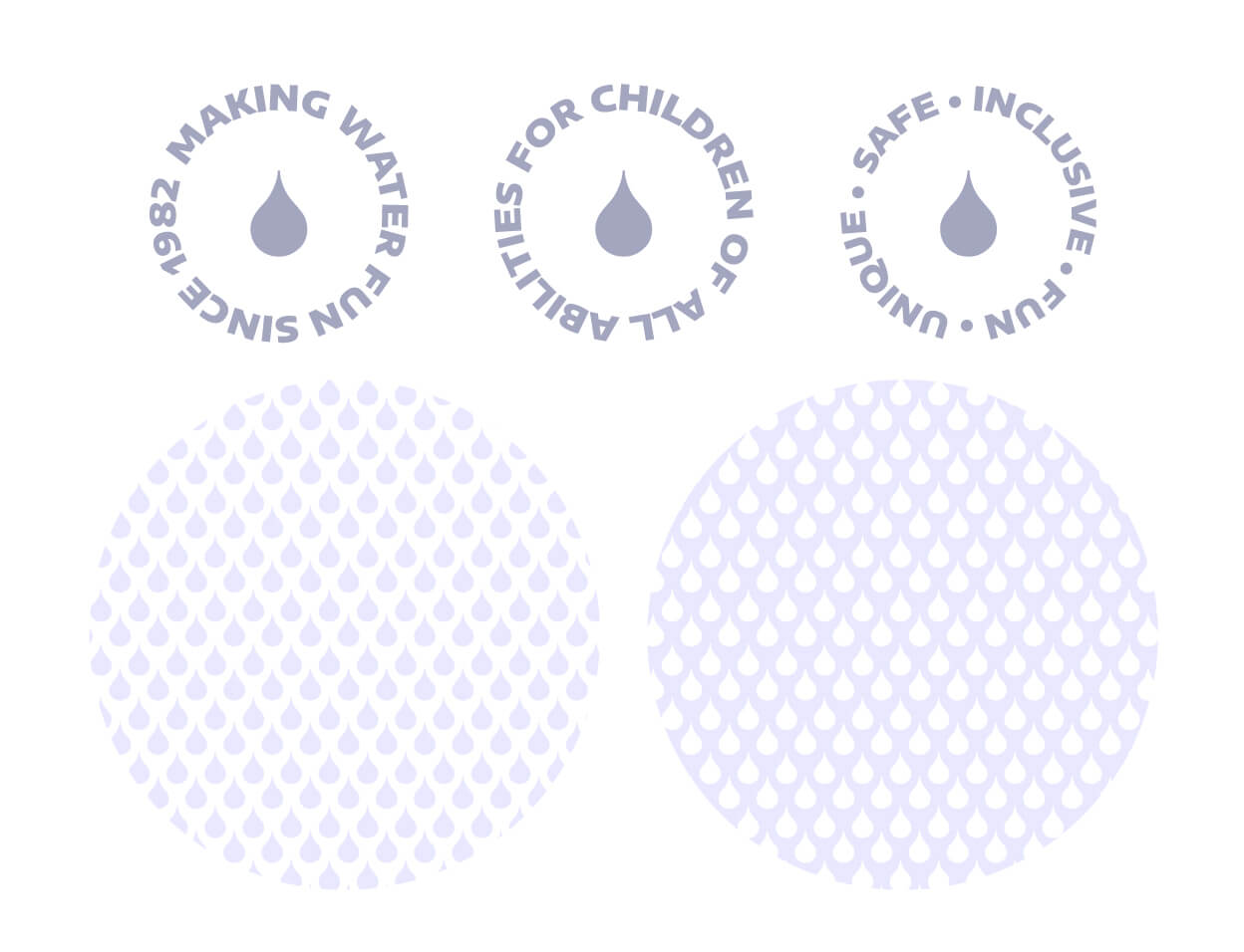
Rain Drop had previously used multi-colored, droplet-shaped graphics in their branding, and they requested a similar way to incorporate the new colors. We created a few “blob” shapes and wavy lines that are used to add pops of color to our layouts. We also use the shapes as photo or text containers. Since we kept Rain Drop’s original logo, we decided to incorporate its “drop” shape into other graphic elements in order to keep the existing logo connected. We used the drop to create a subtle pattern that we could use for overlays or backgrounds. We also developed stamps with circular type using Rain Drop’s various taglines, which can be used on their own or overlapping other elements for an interesting layered effect.
Stylescape Layouts
The Stylescape
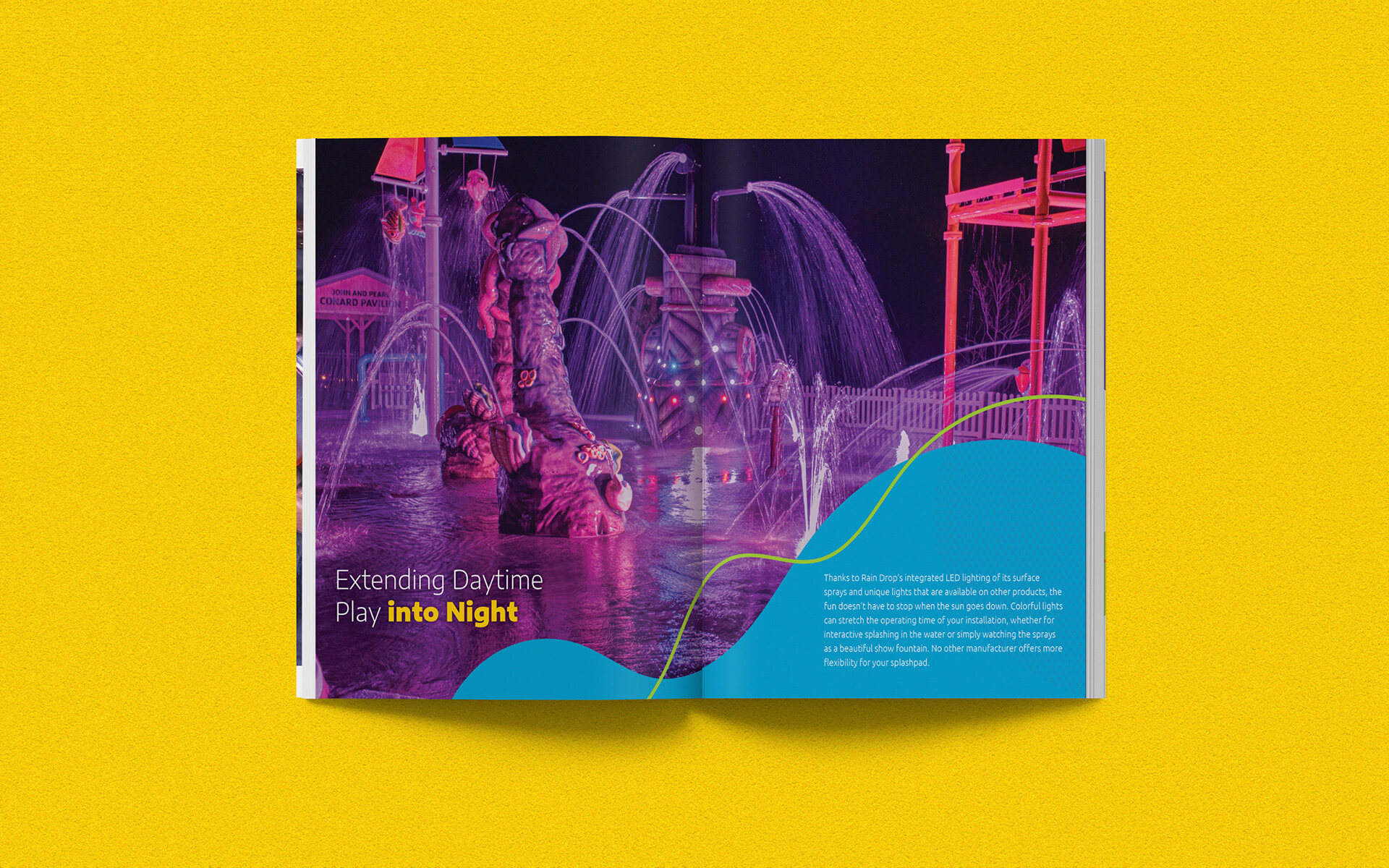
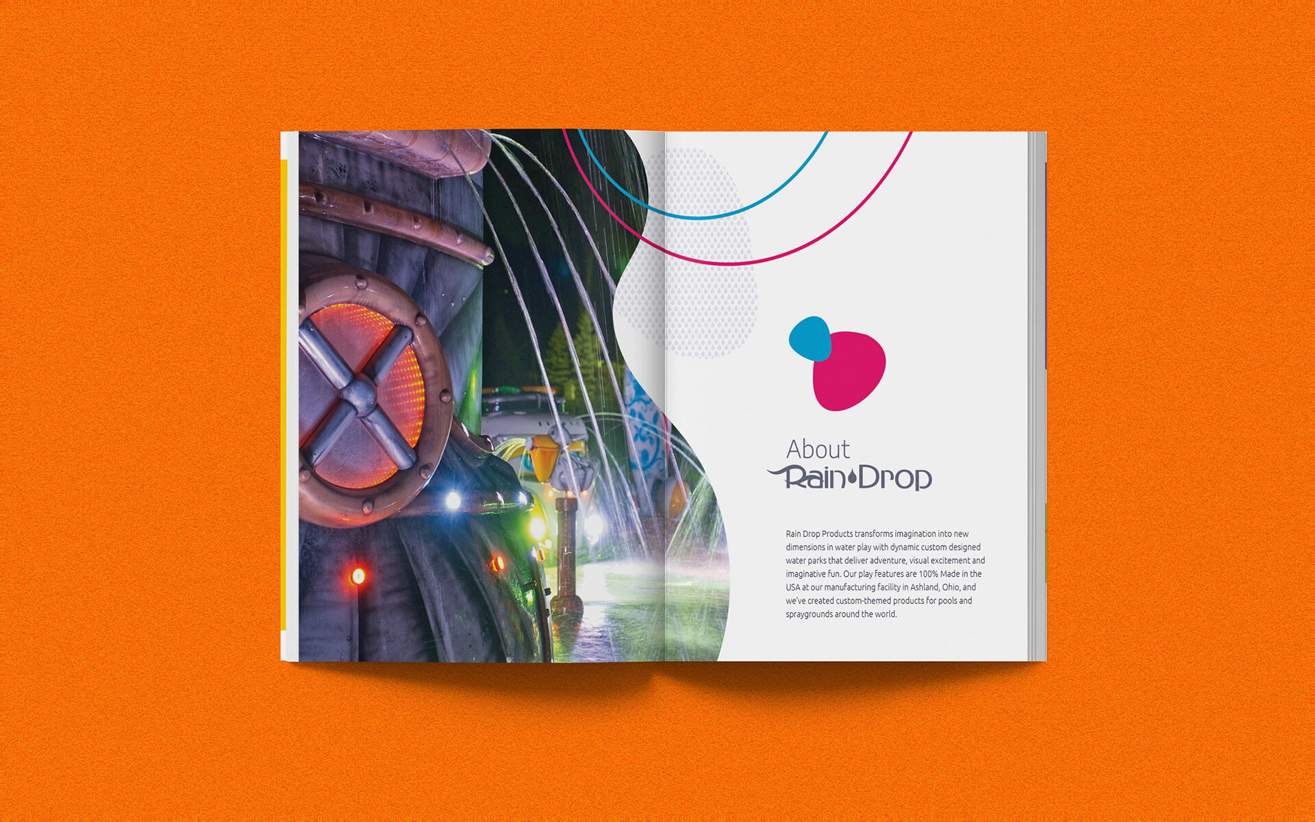
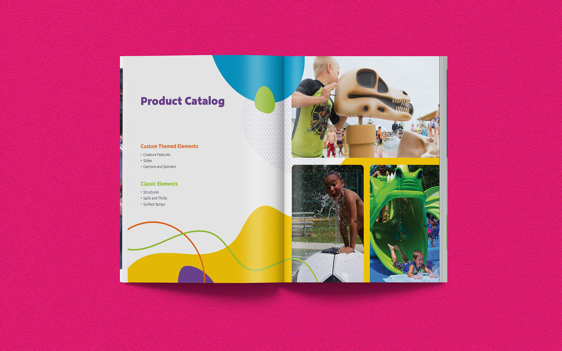
Once we’d established the graphic elements, we used them to design a stylescape. This would serve to demonstrate how we intended to use the new elements. This consisted of several mocked-up layouts using Rain Drop’s existing copy and imagery. By doing this, we showed how collage layouts, photo overlays, and text treatments would work with the new aesthetic.
Catalog Layout
Tradeshow Material
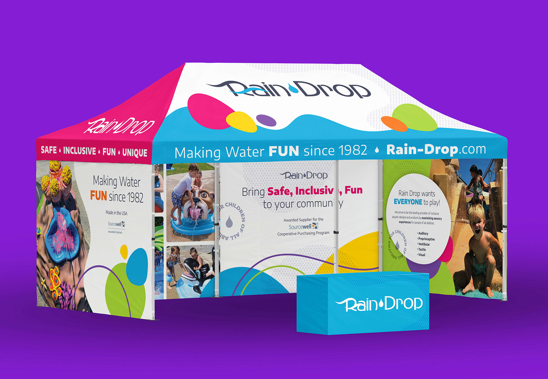
Although the new visuals will eventually extend to the entire brand, a new catalog and tradeshow tent were the first pieces that were needed. When the client was pleased with the direction we presented in the stylescape, we got to work laying out a 44-page catalog to showcase Rain Drop’s work. This involved photo selection, copywriting, typesetting, and arrangement of supplemental graphics. Designing the tradeshow tent presented some unique challenges. We had to be mindful of photo quality when printing large scale, as well as legibility from a distance. Bright colors help the tent to stand out on the tradeshow floor. Carefully-selected imagery and bold taglines help to immediately inform visitors. These pieces gave Rain Drop a reinvigorated presence at the show, and the new aesthetic can easily be applied to additional brand collateral.
