Martin Aquatic

Taking the family-owned firm through the complete process of changing its name and communicating with its longstanding clients

Goals

When the leadership team of Aquatic Design & Engineering (ADE) realized the potential for brand confusion within its acronym-crowded industry, the 30-year-old family-owned company approached Ectovox to help position itself better against competitors with like-sounding names. The client kept an open mind to all possible identity transformations, even if that meant changing its name.

Execution

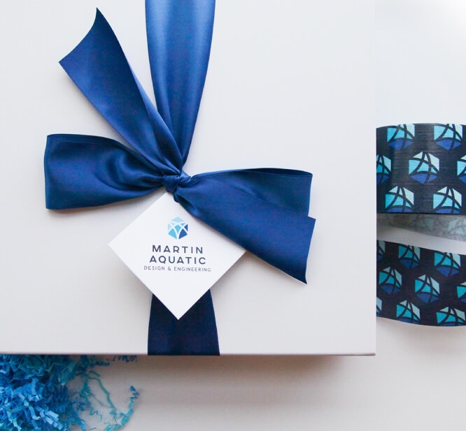
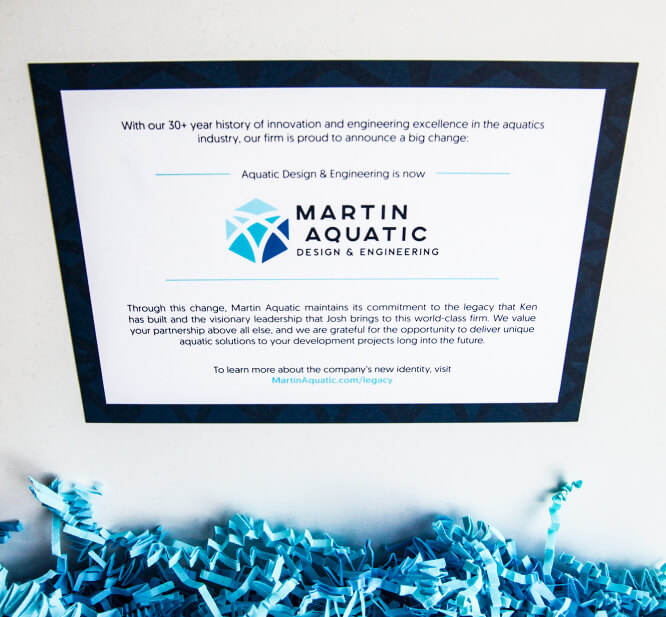
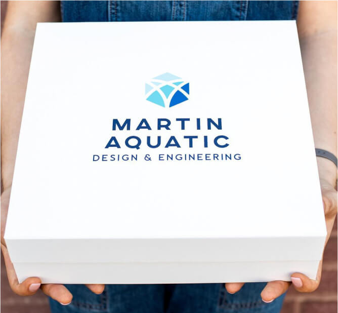
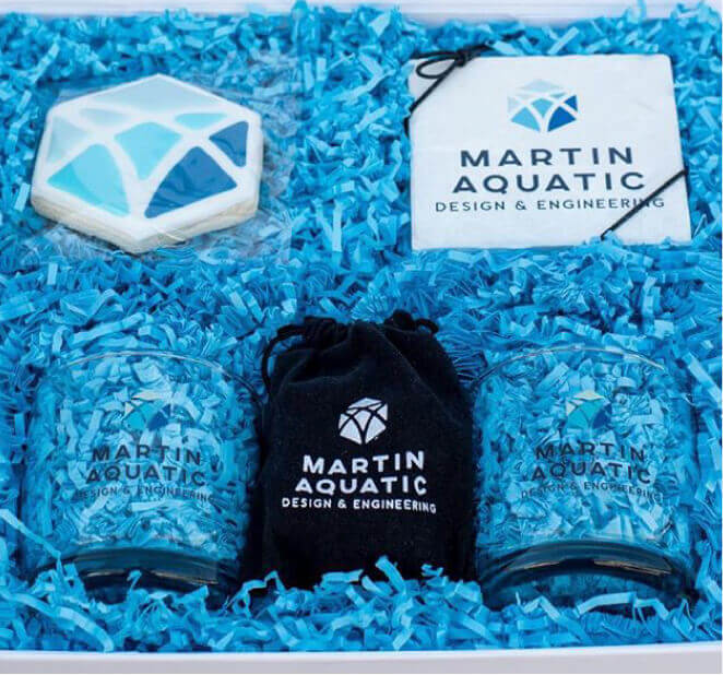
Using valuable research collected through client interviews, Ectovox helped the company proceed with a complete change—adding “Martin” to the company name in honor of its founding principal and the continued legacy of leadership under the current president. This father-son duo had become synonymous with the company’s identity according to client feedback, and the new name of Martin Aquatic Design & Engineering was a fitting progression. The client research also helped drive elements of the identity, and from there, Ectovox handled all creative design for Martin Aquatic’s materials and collateral. In addition to online/digital messages, the new rebrand was announced through a specialty gift box delivered to 400 of Martin Aquatic’s clients.

Results

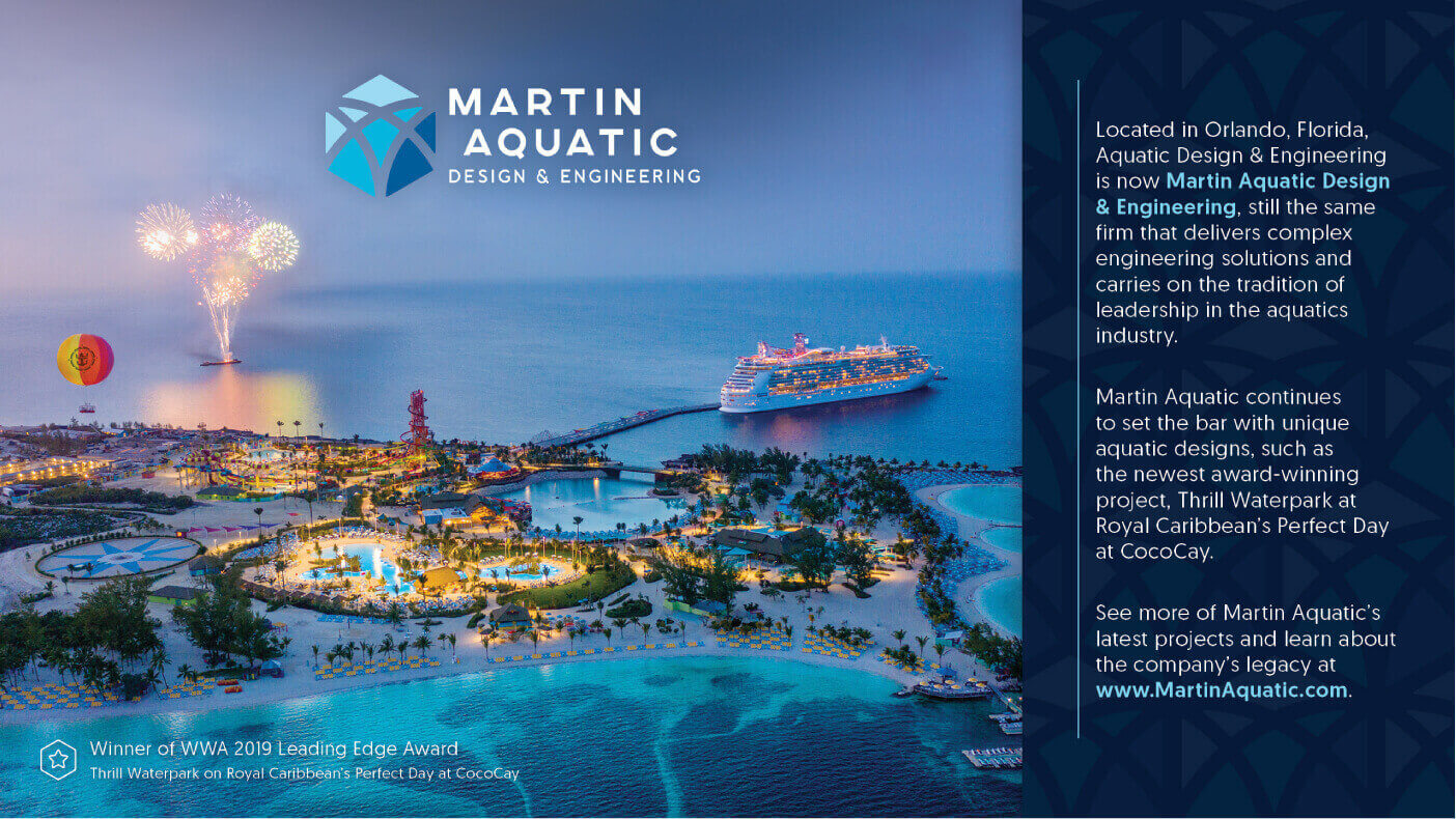
The rebrand of Martin Aquatic launched with incredible client acclaim and feedback. Coinciding with a major industry tradeshow that was taking place in Martin Aquatic’s hometown, the launch provided the perfect opportunity for the company leaders to engage with their partners and clients in a face-to-face setting. As well, the entire rebrand and campaign garnered a 2020 Golden Image Award from the Florida Public Relations Association.

Services

  • Competitive Analysis
  • Research Evaluation
  • Color Palettes
  • Logo
  • Theme Story
  • Copywriting
  • Print and Digital Collateral Suite
  • Website
  • Video Direction
  • Brand Launch
  • Online Promotion Campaign
Case Study - Martin Aquatic - Branded Items

The Logo

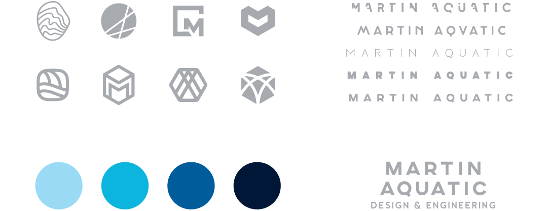
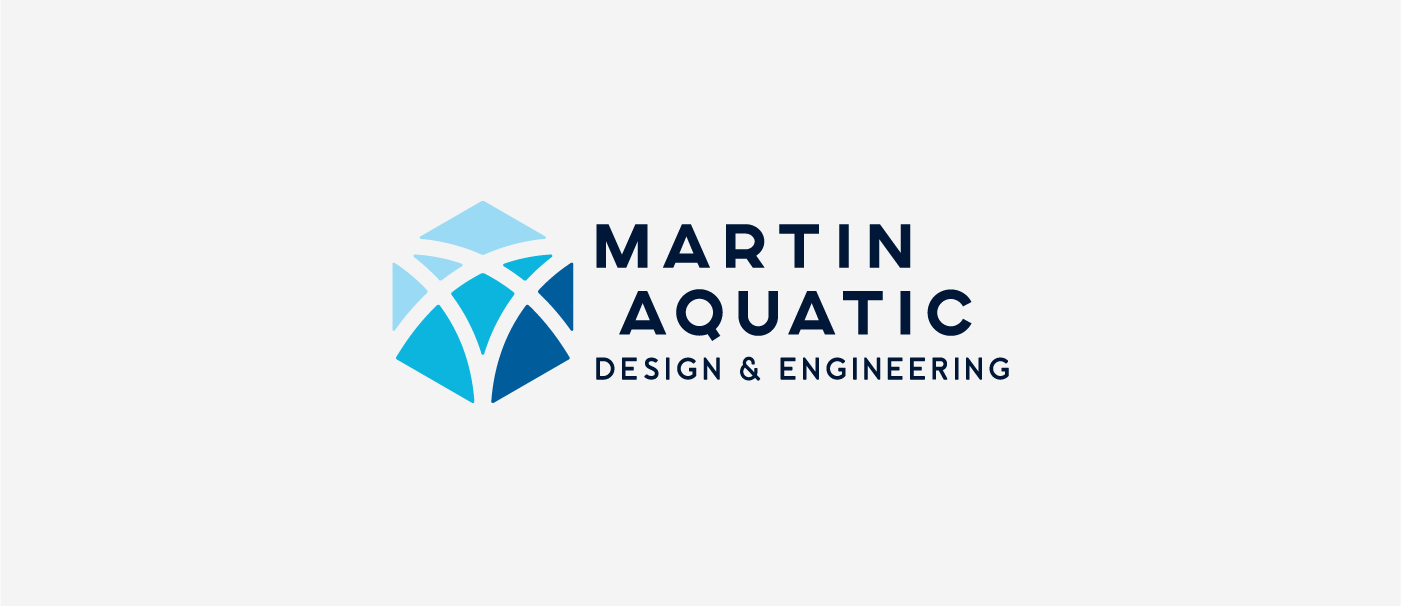
Using both research data and client preferences to help shape the logo design, Ectovox set out to create an identity that wasn’t the cookie-cutter logo of other companies in the aquatics industry. Because the company wanted to break away from the confusing acronyms used by many of its competitors (all using variations of “aquatic” and/or “design”), the logo concept focused more heavily on the two words of “Martin Aquatic,” which was determined would be the shortened form of the name. As well, the client wanted to avoid any graphical elements that were overused in aquatics (and used in the past by the company itself) such as water drops and waves. Ectovox brought in a unique icon to represent nuanced attributes of the company that surfaced from the research: how the company doesn’t just design “square pools,” how the company is multifaceted and versatile, and as well, a subtle nod to the new “M” of Martin Aquatic. The result: a sleek, modern typeface that boldly showcases the preferred moniker coupled with an iconic graphic that is unique in its industry with the power to stand alone as a strong emblem.
Case Study - Martin Aquatic - Logo Components
Case Study - Martin Aquatic - Final Logo

Primary - Horizontal

Case Study - Martin Aquatic - Logo Vertical

Alternate - Stacked

Case Study - Martin Aquatic - Logo Dark BG

Primary - White Text

Case Study - Martin Aquatic - Logo Vert Dark BG

Alternate - White Text

Case Study - Martin Aquatic - Logo Spacing and Alignment

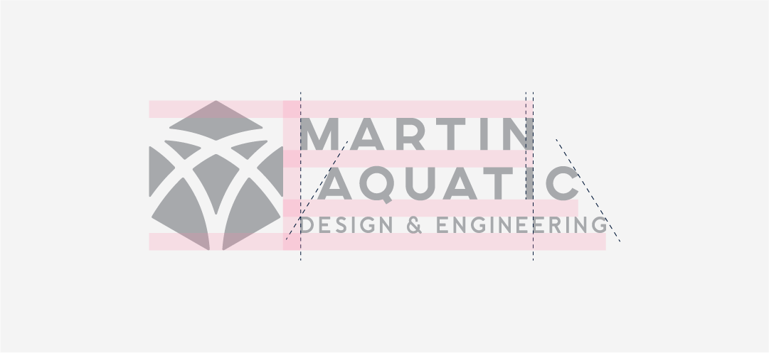
Spacing and Alignment

Case Study - Martin Aquatic - Pattern 1
Case Study - Martin Aquatic - Pattern 2
Case Study - Martin Aquatic - Pattern 3

Collateral

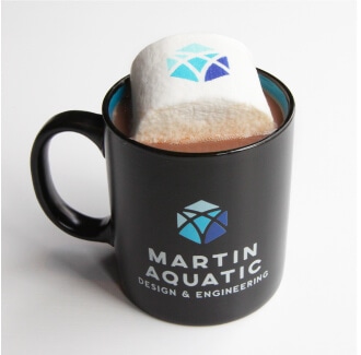
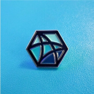
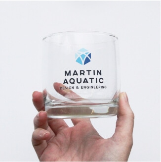
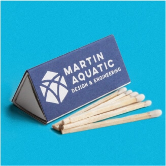
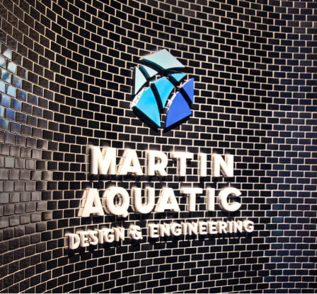
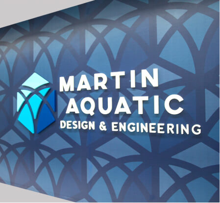
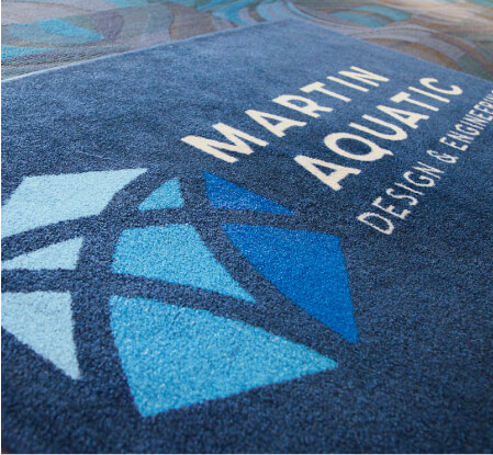
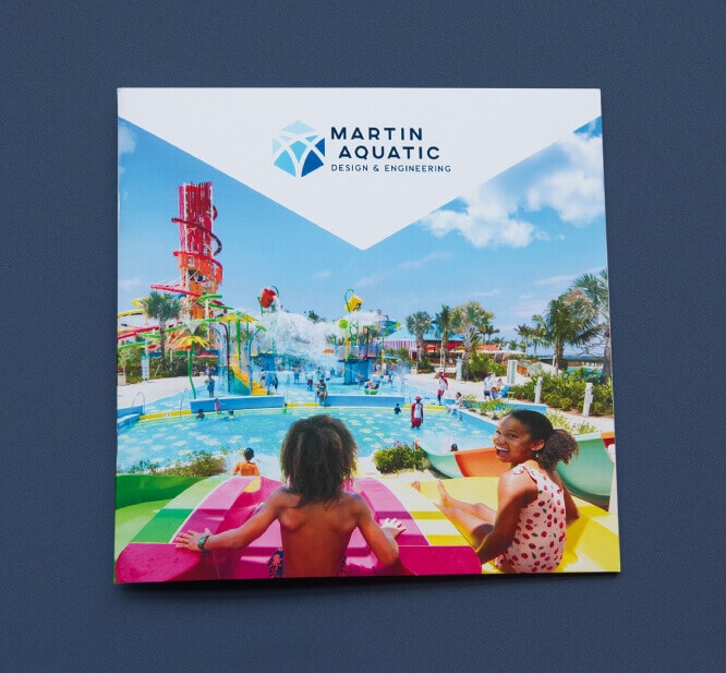
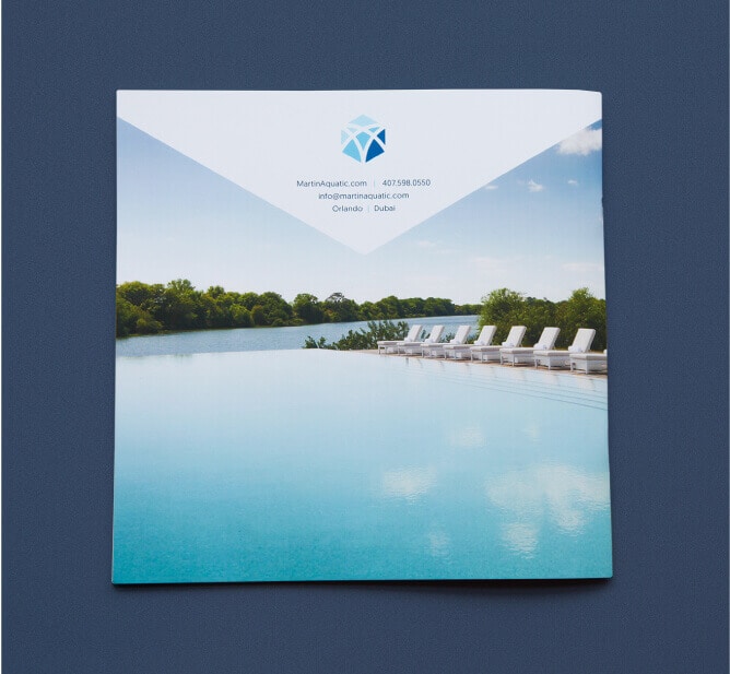
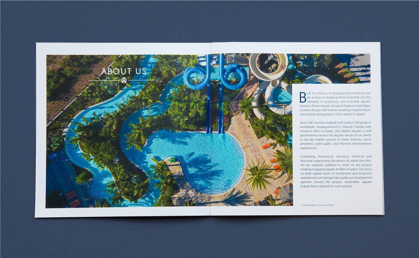
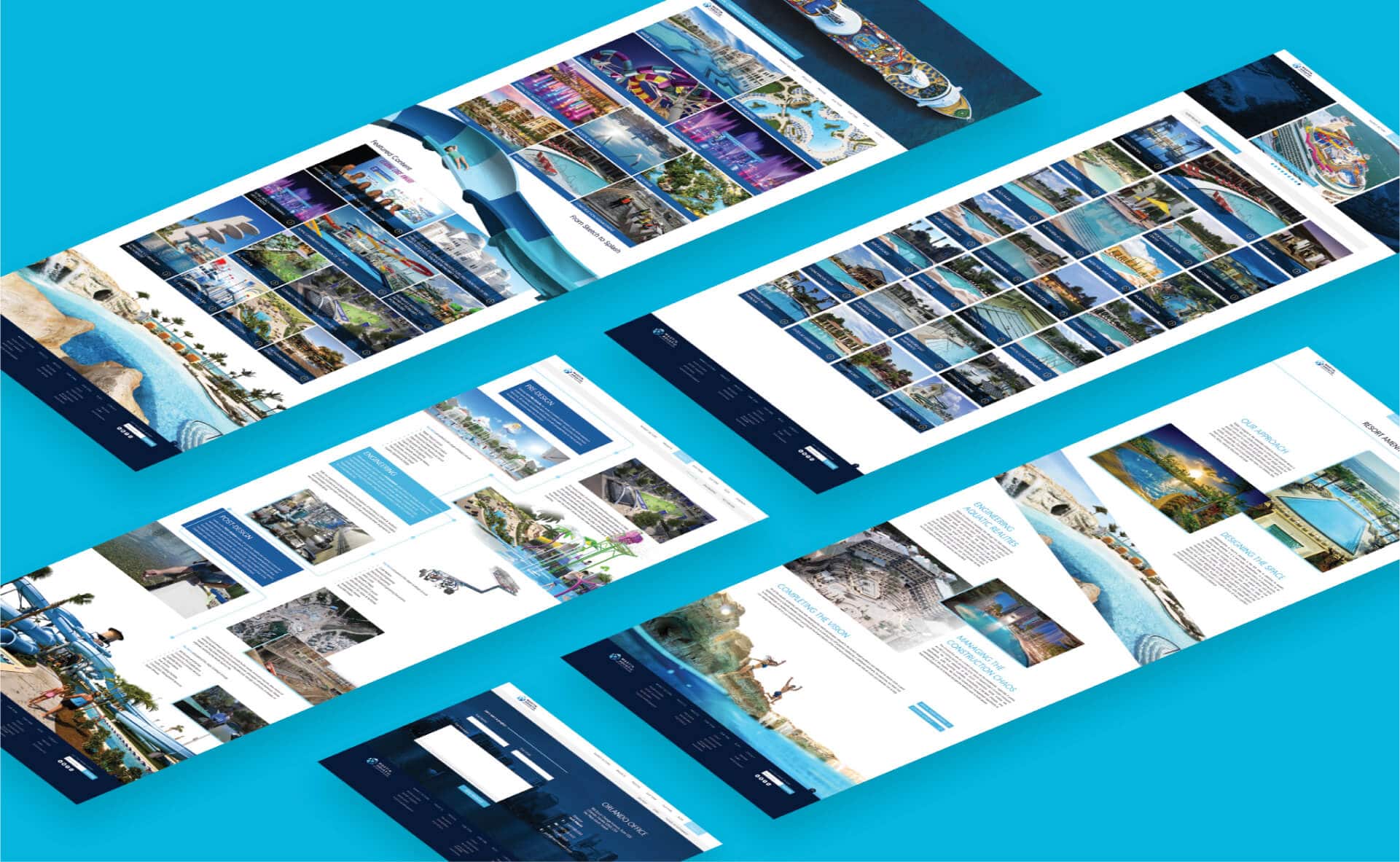
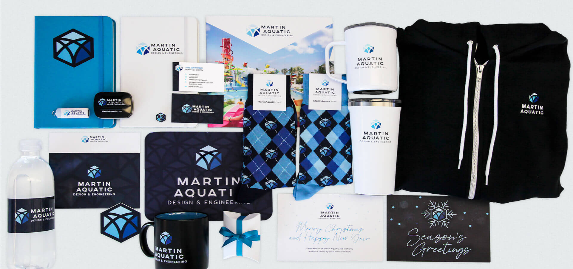
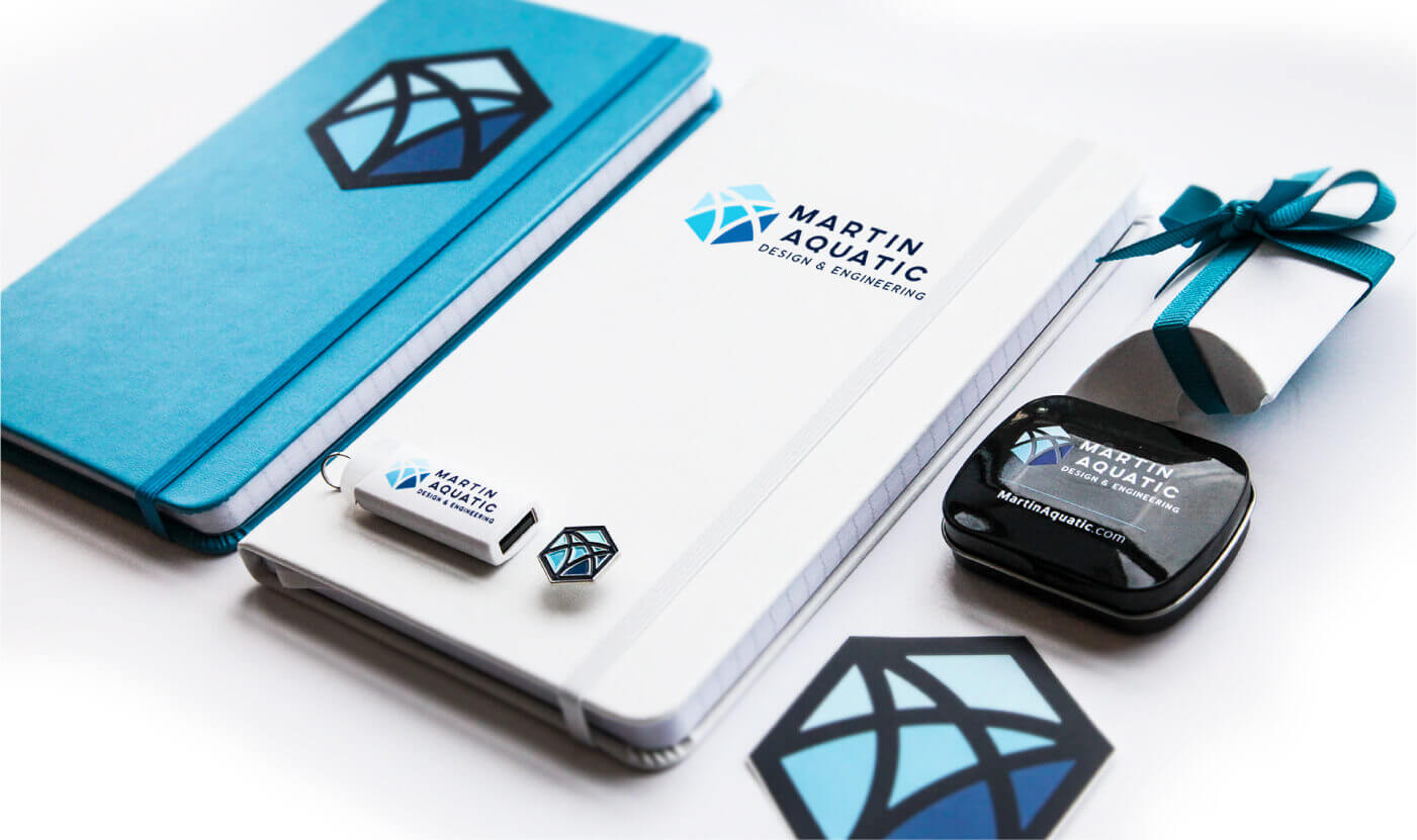
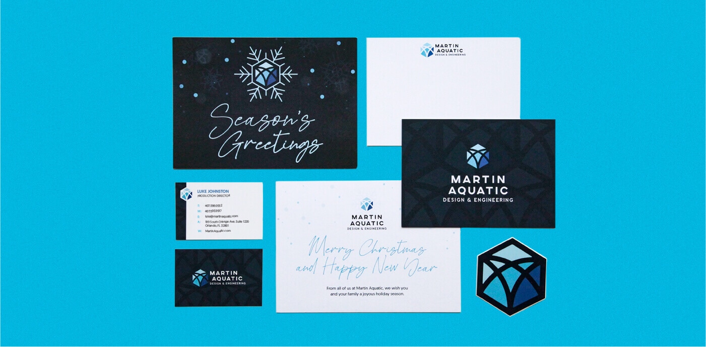
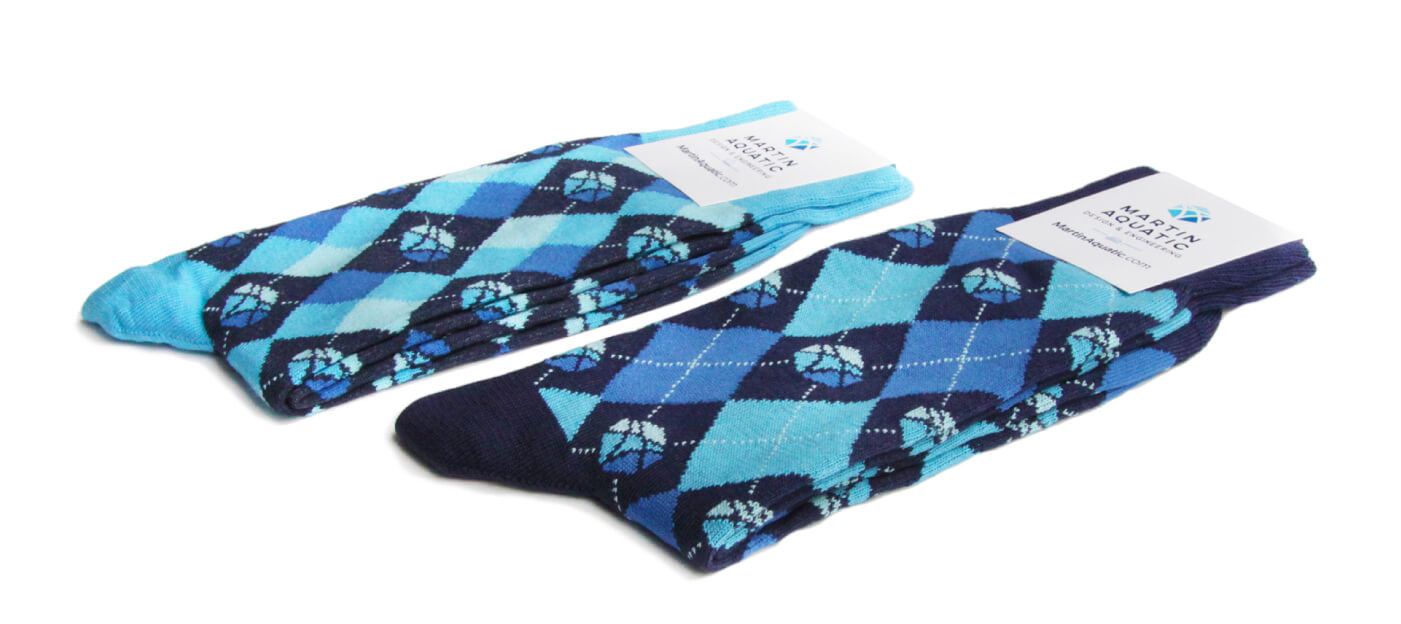
With the unique icon in Martin Aquatic’s logo, much of the company’s collateral was designed to reinforce that graphic. From business cards and letterhead to signage and apparel, Ectovox designed simple and straightforward materials using the hexagon element. For brochure collateral and advertising that involved depicting Martin Aquatic’s spectacular aquatic projects, the icon took a backseat to the imagery, with subtle diagonal lines and small hexagonal bullets.
Case Study - Martin Aquatic - Printed Items
Case Study - Martin Aquatic - Socks
Case Study - Martin Aquatic - Mug
Case Study - Martin Aquatic - Pin
Case Study - Martin Aquatic - Tumbler
Case Study - Martin Aquatic - Matches
Case Study - Martin Aquatic - Entry Wall
Case Study - Martin Aquatic - Grotto Wall
Case Study - Martin Aquatic - Rug
Case Study - Martin Aquatic - Qual Pack Front
Case Study - Martin Aquatic - Qual Pack Back
Case Study - Martin Aquatic - Qual Pack Spread
Case Study - Martin Aquatic - Website

Rollout

When it came time to announcing the new name to Martin Aquatic’s clients and other partners in the industry, Ectovox assembled a specialty gift box of luxury branded products including whiskey rocks glasses and ice stones, stone coasters, and a hand-designed cookie. Each box arrived at clients’ offices nearly simultaneously as the email newsletter sent from the president. This digital announcement contained a link to a 2-minute-long video about the company’s legacy that was produced by Ectovox.
Case Study - Martin Aquatic - Box Closed
Case Study - Martin Aquatic - Box Open
Case Study - Martin Aquatic - Box Ribbon
Case Study - Martin Aquatic - Box Note
Case Study - Martin Aquatic - Launch Announcement
Case Study - Martin Aquatic - All Merch