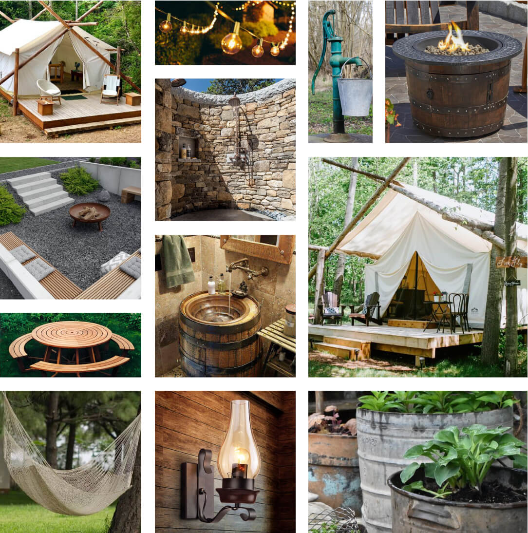
Camp Aqua Mood Board
The Logo: Round 1
Working with this client meant that Ectovox had to combine the vision of three key decision makers who each had three different ideas for what Camp Aqua and its brand represented. Because the camp was located in Tennessee, one of the first concepts that was brought forward was to incorporate traditional elements from the 1800’s, celebrating the local history of the destination. The logo that resulted focused on traditional iconography with a flair based on classic printing styles.
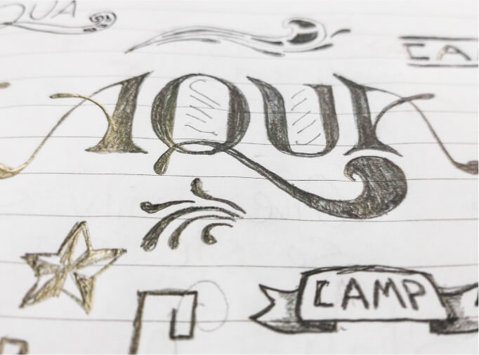
Initial Hand Sketches
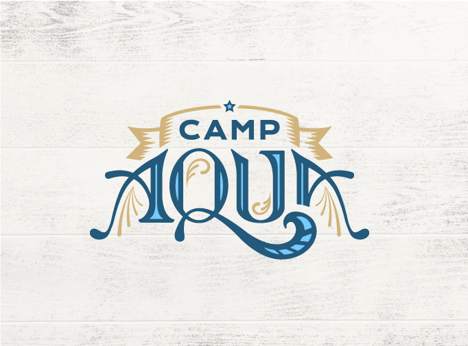
First Draft
Round 2A
At the same time, one of the owners wanted to see the brand reflect their focus on creating a “glamping” resort, with the logo having a very clean, “South Beach” type look. Ectovox delivered logo drafts that would translate to their upscale, glamping resort and spa concept.

Round 2B
As a final approach, the owners asked to take a departure and develop a brand identity that was both modern (and would not limit franchise opportunities in other locations) but also friendly with more graphical elements.

Final Selection
Ultimately, the logo selected represented an icon that could be used in a variety of applications and match the theme of different locations. It also appealed to numerous demographics with its friendly typography and graphics. The new logo for Camp Aqua can be shared across locations and showcases the overall brand of the camping destination which is all about water, sunshine, and being outdoors.
Final Design
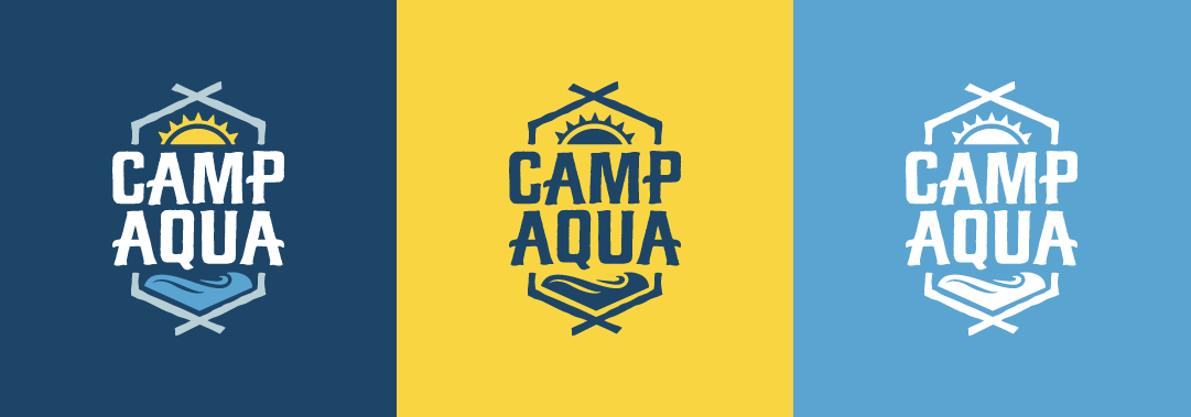
Alternates
